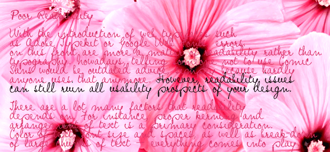
Consider website readability.
Nothing makes me hit the back button faster that orange text on a royal blue background. In fact, I generally avoid any site that appears to have been designed to induce a migraine!
Body text should be dark text on a light background because computer monitors generate an annoying “glow” when white text is placed on a dark background. Many people want to use white text on a black background, but I do my best to discourage that for this reason.
Consider the most widely read websites in the world, such as Google, Facebook and Wikipedia. They all know the black text on white background research.

As for fonts, there are now thousands to choose from, but make sure they are readable in a paragraph block. If not, use them just for large headings and use a compatible but clearer font for the paragraphs.
Your site should look best when the browser font size is set to the default of “medium”. However, users should not be restricted to only using one size font. It might look messy, but users with poor sight really do need to be able to use the larger font options and get understandably annoyed with sites that don’t allow that option.
Website readability is also an important consideration for responsive websites – sites that change to suit all screen sizes, from desktops to phones and tablets.
Paragraphing is important.
Break your text into far more paragraphs than your grammar teacher told you was correct at school.Shorter snippets of information are easier to read and line breaks to begin new sentences help immensely.
Shorter snippets of information are easier to read and line breaks to begin new sentences help immensely to improve website readability.
- Shorter snippets of information are easier to read and line breaks to begin new sentences help immensely.
- Try to avoid a paragraph that is longer than 4 lines of text.
- Use dot points for lists rather than commas.
- Clear text is a hallmark of good websites.
Remember, the vital test is how easy you site is to read. So run your copy through the Flesch Reading Ease test and, if necessary, break sentences down into shorter ones.
