
People Use Mobile and Desktop Devices in Different Ways
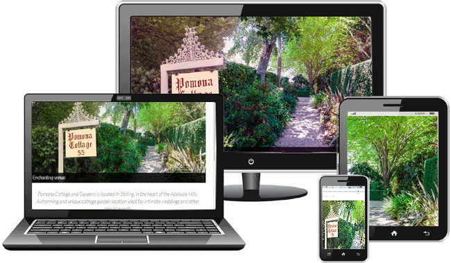
85% of people say mobile devices are a central part of their everyday life, so obviously your website needs to be RESPONSIVE to perform well on the tiny screen.
However, the way people use their mobile is quite different to how they use a desktop PC.
So, what are the essential differences between how people use mobiles and tablets compared to a desktop PC?
1. People have very different objectives when using a mobile compared to a desktop PC.
A desktop PC will be used to find details of products or services, whereas a mobile device is more generally used for a quick search for specific information, such as price, contact details or opening hours.
Mobile users tend to immediately go back to their search results if the site they find is not optimised for mobile use.
2. “Content is King” regardless of the device.
When it comes to types of content, users generally don’t browse websites on their mobile device. Research indicates that mobile users scan rather than digest content, so the way content is presented must be considered to compensate for the fact that mobile users pop onto your site for a very short time.
4. Desktop Users Still Outnumber Mobile Users
We cannot design entirely for the mobile experience because, according to Search Engine Watch, desktop visits last 3 times longer on average than mobile visits, with more pages viewed and half the bounce rate. This is because when mobile users land on a page they don’t want to pinch and resize, they want a mobile-friendly, responsive design to guarantee a smooth browsing.
With that in mind, after adopting a responsive design, most websites report a 30-40% traffic increase.
5. Some Businesses Do Not Consider What Users are Looking for on Their Website
To understand what users are looking for when browsing either on mobile or on desktop we have to look at their motives.
There is no doubt that users on smaller devices have different motives from those on desktop devices and the needs of a mobile visitor tend to be more utilitarian.
Serious errors occur when a website forces the mobile user to wait for pointless photos to load or, worse still, a video.
While desktop users are more open to design elements, such as images and boxed information, these do not suit the quick informational need of the mobile user.
6. Time Spent on a Page Matters
Mobile users are impatient! According to KISSmetrics, 40% of people will abandon a website if it takes more than 3 seconds to load and 46% of mobile users say they are unlikely to return to a website they had trouble accessing in the past.
With such a large volume of information literally in their hands, mobile users rarely go idle – a page is either open and active on the device, or it is closed.
In contrast, desktop users will open tabs, leave them idle, and come back to them. As Chatbeat found “the amount of time that people spend idle on landing pages actually correlates positively with their likelihood of returning to your site on future days.”
7. User Preference for Apps vs Web Sites is Still Debatable
This is a hotly debated topic. Some researchers claim use of apps is rising, however, according to others the adoption of desktop apps is falling as users prefer browser-based sites.
The data is hard to analyse because mobile usage of apps is over 90% based on Facebook and other social media apps.
It is difficult to make a case for the need for an app for the average online business, especially when the high developmental cost is considered.
8. Are Mobile Users are Younger?
No, data does not support this idea.
While younger users may use their mobile devices more to play music and check social media, the use for browsing websites (other than social media) shows no noticeable difference between ages groups.
10. Users Prefer Researching on Mobile, BUT Purchasing on Desktop
Mobile commerce has changed the way users behave. Users check reviews and compare prices while on the go. and when in a store 82% of smartphone users turn to their devices to help them make a product decision.
However, while mobile internet usage for quick research is on the rise, people still tend to switch to desktops to complete their transaction. 37% of mobile users said that they use their mobile device to do research, but they go to the desktop to make the purchase.
Conclusions
In order to cater for the needs of mobile users keep in mind:
- Easy adaptability between screen sizes
- A fast website that offers an instant response
- Obvious phone number and contact details
- Accurate and up to date information
- Easy navigation
When considering how your website adapts to the mobile environment, one fact remains vital:
Users always seek relevant, actionable information that helps them better their lives, so help them achieve exactly that.